Friday, 30 December 2011

For all you fellow Earth-lovers, let's get GREEN people!

The process of silk screening is quite unique; and in order to achieve my result, the materials I needed were fabric stapled tightly around a wooden frame, fabric paints, the canvas bags, and something to spread the paint across the fabric.

This was my test silk screen. I used block paint for this paper tester which is washable, unlike the fabric paint I used on top of the canvas bags.

These three silk-screened canvas bags were my final marketable product. I enjoy the distinct and bright colours, don't you?

For the last type of media, I did a silk screen of a photograph I shot of a front-angle view of a bicycle in Stratford, Ontario. I am intrigued by and love everything about bicycles, from their practicality, beautiful complexity, and how amazing they are of a method of transportation due to its amazing environmental impact, so I was inspired as soon as a saw this vintage bike downtown. Immediately after capturing this photograph, I knew I needed to do something with it. I'm ecstatic I decided to do a silk screen of this photo, both inverted and normal. 

This process is by far the longest and most complicated process I have ever tried in photography; however, it is also the most rewarding. After deciding I wanted to use the photo of the bike for one of my three mediums, at first I chose to do a cyanotype. However, conditions like poor weather and lack of sunlight failed to provide me withany successful results. That is when I made the decision to make a silk screen rather than a cyanotype. For an interesting spin on the silk screen, I used the acetate of the inverted image that I would have used for the cyanotype, but also burned the non-inverted acetate into the silk screen as well. After vigorously scrubbing the silk screen with water and a sponge, I was ready to start seeing my results. On my first tester, I used the normal acetate as the black base, and then applied the inverted image in a different colour on top of the normal one (2nd image). I was thrilled with the results, and continued on doing the exact same technique for all three canvas bags, which I feel turned out to be an extremely successful and creative product.

I chose to use this media as my marketable item for a couple significant reasons. Firstly, I really love the photo of the bike. I decided to explore the theme of environmental consciousness and awareness, for its something I have been extremely passionate about since I can remember, and what better way to showcase my photograph than on reusable, recycled cloth bags, which implement the notion of reduce, reuse, recycle, just as the option of a bike over a car does. These bags can be used as reusable grocery shopping bags, a tote for the beach, and many more!

I shot the original photograph of the bike (below) with a Canon Rebel T2i with an 18-55 mm lens, with an aperture of f10 and a shutter speed of 1/80 of a second.


Friday, 23 December 2011

Photogram Collage Collection

For the second type of media, I did photograms. The process in order to achieve these images was to place a bunch of random objects that your creative juices conjure up on top of a piece of photo paper in the dark room. When you expose the piece of paper to light, whatever is exposed turns black. However, the beauty and fascination of this type of media is that the objects on top of the paper are protecting it, and therefore stay white, for they are never exposed. What I did to achieve an even greater effect was I moved a selection of the objects while the light was still exposing the paper, in order to get some greys in the photo, not just black and white. Some of the objects I used were a pair of sunglasses, a few necklaces, an intricate barrette, string, earphones, a silly band, a dog chain, a comb, and a Canadian dollar bill. If I were to choose a favourite item I would probably have to say the pearl necklace, for I enjoyed the structure and shape of it against the hard black, and also simply because I love pearl necklaces.

Thursday, 22 December 2011

Glued to your Roots, literally.

Acrylic lift- photograph shot with a Canon Rebel T2i with an 18-55 mm lens, with an aperture of f9 and a shutter speed of 1/80 seconds.

For this assignment, our task as a class was to create three different types of media incorporating an interesting and meaningful photograph you took. For the first one, I did an acrylic lift of a picture of a tree's branches (taken from the bottom, under them) with a bit of an eclectic and quaint building at the top. I took this photograph while in the beautiful, downtown Stratford, Ontario, a very musical and artistic town. What intrigued me about this photo and setting is the symbolism and beauty of the point of view. In my mind, I imagined being the roots of the tree, taking it from their perspective. The roots of the tree are significant because they represent the strong and pure base. With the quaint building at the top, which shows the rich history and culture of Stratford, it all ties together the notion of sticking to your roots, or your people, or heritage, etc.

I chose to do an acrylic lift for this photograph because I imagined the way the branches would contrast with the light sky background, which would create a very interesting effect. In order to make an acrylic lift, there are a few required steps to do prior in order to get there. First, you choose a photograph of yours that you feel would be good for an acrylic lift, and then you print it using a laser printer. From there, you duct tape the paper down to a wooden board, start applying relatively thick layers of glue over top of the picture, and then making sure it's dry before apply the next coat. Just to be safe, I did nearly thirty layers, when really fifteen would have been sufficient. Once I had the layers and they were dry, I soaked it in water and proceeded the vigorous duty of rubbing off all the paper on the one side of the acrylic lift. Once all the paper is gone, all you have left is the multiple layers of acrylic with your image on it. It is a very unique and fun process, and I enjoyed it very much, with an end product I can be proud of.

Tuesday, 20 December 2011

Breaking Some Rules... of Composition

This breaks the concept of normal or ordinary. Typically, if I were to follow the guidelines of composition, the top of the gingerbread house (bottom of photo) would be in focus, as supposed to the tree and candles which are in focus. Also, I would have changed the background to make it more simplistic and balanced. This was taken with an aperture of f7 and a shutter speed of 1/80 seconds.

This photo was taken with a shutter speed of 1/15 of a second, with an aperture of f5. What intrigued me about this photo was its retreat against normality and regulation. The difference of light and strength is highlighted here, with the lights on the pillar versus the lamp. This photo breaks the rule of balance, rule of thirds, and other rules of composition.


After two years of training my mind and hands to follow the basic rules of composition of photography, this assignment did not come at all easy. When taking photographs, my initial instincts tell me to consider the rule of thirds, and if the photo is balanced, and whether it is simplistic or not, etc. However, with this assignment, I had to bottle up all those trained instincts and rules in order to be successful with this assignment. My tactic to tackle this assignment was to put myself in the shoes of a curious, care-free, inexperienced child. As children, you don't think about the complications or restrictions of the real world; you just do what comes natural, comfortable, and easy, and that's what I adore about the innocence of the mind and imagination of children. All photos were shot with a Canon Rebel T2i with an 18-55 mm lens.

Friday, 11 November 2011

(I want you to see) ALL OF THE LIGHTS


The concept for these photographs was to take them with multiple and varied light sources, rather than just the flash of the camera, or the provided light in a room, etc. I incorporated natural light from the sun, as well as light from a plugged-in bulb into these three photographs. I used these  light sources differently in each shot which, in the end, provided me with interesting, beautiful, and captivating shots.
For the first photograph, I placed the bulb beside the person's face, illuminating it and casting a pleasant, soft glow onto my subject, who stood facing the natural light. I also love the genuineness of her kind emotions, which added to the overall subsistence of this photograph. For the second photograph, my subject was faced with her back to the natural light, but the bulb placed relatively close to her face, lighting up half of it and casting a mysterious and alluring presence. A feature that I love about this photograph is the warm, orange hue that the light projects, which softens the photo. I also like how the natural light behind her outlines her figure, helping my subject stand out even more.  For the third photograph, I took the shot from the outside of the glass looking in, with my subject close to the glass on the inside, with the bulb lighting up her face from the inside as well. I caught the reflection of the breathtaking scenery behind me in the glass, and had my subject "smiling towards the sun" on the inside. For an instant, she appears to be in the same setting as the background, however she is posed inside which coincidentally fit perfectly with the reflection on the glass.

What I especially like about these photographs is that they are especially unique and beautiful in their own way because they are created through various types of light. They each seem to tell a story as well as showcase a piece of their personality. I shot these photographs with a Canon Rebel T21 with an 18-55 mm lens, a shutter speed of 1/60 of a second, and an aperture of f8.

Saturday, 5 November 2011

Can anyone see me?


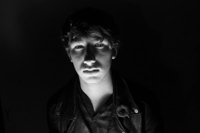
I always imagined taking portraits like these would be simple and easy; I never considered the multiple components necessary in order to capture a successful portrait photograph. I never knew the difficulty in capturing the perfect lighting, or the best aperture and shutter speed for the type of photo I want to take, or the perfect timing required so that the photo conveys your message or purpose. After this assignment, as well as every other assignment thrown my way, I truly appreciate all types of photography more and more.

My inspiration for these shots was quite clear to me from the beginning: I wanted to convey the message of someone who feels like an outcast; someone who feels invisible to the world around him. I wanted the viewers of this photograph to feel the model's sadness and desolation, as well as the lust to just simply fit in. I believe my photographs channel the theme of feeling like an outcast or a "nobody". I was trying to showcase someone who attempts to put himself in different settings, or at a fresh start or "new light" as some people refer to it as, in order to fit in, yet no one notices. I captured this message through this person's expression and positioning as well as my manipulation of the camera and the lighting I used. No matter what light he was in, whether it be spooky or "scary" lighting (where the light source is psitioned below the person's face), or side lighting (where the light source is positioned at the side of the person's face, highlighting only half their face), or of course, head on (where I used two light sources in order to light up the entire face), they all attain a certain mystery that draws the viewer in to the pictures as if they are being told a story; a story about a person that is just trying to fit in and "be seen", yet he unfortunately can't seem to accomplish this goal. For my photographs, I used a Canon Rebel T2i with an 18-55 mm lens, a shutter speed of 1/125 of a second, and an aperture of f12.

Tuesday, 1 November 2011

Hidden Identities


For this assignment, the technique I used is referred to as "painting with light". When I first heard of this expression, I didn't know what that definition entailed, for I had never seen an example of the technque, nor had I ever tried it. However, when I discovered what the technique was and how to accomplish it, I was thrilled to try it out. I needed some sort of a light source that, if executed properly, would work the same way as a paint brush would in a painting. I used the flash of a cellphone to successfully "paint with light". For the first photo, as you can see, I "painted" the addition of the pitchfork and horns onto my subject to symbolize a devil. I achieved the red hue of the pitchfork by covering the flash with my finger so the light had to travel through my finger in order to be captured by the camera, which then successfully transformed from white light to red, which added an ideal component to a devil. I then released my finger off the light source to "paint" the horns, so the full light could be captured by the camera. I also did this because, by letting the full light source be shown, it becomes a larger "stroke", which casted a slight shadow or blur on the person's face so that the person wasn't the subject of the photo, but the actual devil figure was. For the second photograph, I "painted on" wings and a halo to my model to represent an angel. As I did for the horns in the devil photograph, I allowed the full light source to be flashed onto the camera, in order to achieve the bright and powerful look I wanted for this photograph. My inspiration and motive for these photographs was "hidden identities"; in other words, what kind of person someone really is. I am fascinated by human emotions, passions, actions and histories, which is what derived my inspiration for these photographs. If only in real life you could turn out the lights and have it be this obvious to the human eye whether someone truly is a bad person (devil), or a good person (angel).  For my photographs, I used a Canon Rebel T2i with an 18-55 mm lens, a shutter speed of 15 seconds, and an aperture of f22.

Wednesday, 26 October 2011

Just some harmless Renaissance mocking... Did you find it shocking?

Lavinia Fontana (August 24, 1552 – August 11, 1614) was an Italian painter, with a long 40 year career, which was especially legendary for a women in the Renaissance era. This oil on canvas painting of hers, called "Portrait of a Noblewoman", was created in 1580 and is now featured in the National Museum of Women in the Arts in Washington, DC. What I found interesting about this painting was the complexity, elaborate detail, and drama in her dress contrasted with her simple, boring expression. I found it quite amusing that this portrait was supposed to showcase the women's status, class, and power, yet she seemed lost and frankly quite bored and absent-minded in this painting. I decided to pursue this contrast even further and have a little fun with it. I explored the humour and irony in differentiating the person's dull and boring facial expression in the original photo to the strange, vibrant, funny, "out-there" facial expression of the photo-shopped version on the right. My purpose in doing this was to initiate the surprise factor amongst the people viewing this, as well as give them a little laugh. I shot my photo with a Canon Rebel T2i with an 18-55 mm lens, on a shutter speed of 1/60 of a second, and an aperture of f8. I used the various tools available on Adobe photoshop to crop in my photo to the original, and make it appear as real and authentic as possible.

Friday, 14 October 2011

My Name Created by a Dozen Different Objects


For this assignment in grade 11 photography, our task was to take photographs with a digital SLR camera and re-create our names in a banner using letters that wouldn't normally be perceived as that letter. We had to use our imaginations for each image we shot in order to grasp this assignment and execute it successfully and creatively. 

I believe the purpose of this assignment was not just to take pictures and throw them together in order to create our names. I believe that the goal of this assignment was to exercise our minds and use our brains and eyes more actively and precisely than we would on a normal-day basis. Normally we wouldn't look at our school's outside bleachers and see the letter "T", or observe a wheelchair sign in a parking lot and spot the letter "G". Nor would we go to unlock a closet door and grab the handle and say, "hey look, the letter 'i'!" I believe that perception is everything; the way you look at something is always different than the way a someone else looks at that same thing. When you challenge yourself in this way, afterwards you tend to observe the world differently, and appreciate everything in a new light. 

I shot these photos with a Canon Rebel T2i with an 18-55 mm lens at an aperture of f16 and a shutter speed of 1/100 seconds. I found this assignment very challenging, but at the same time I also found it rewarding and exciting. I now grasp a better understanding of my camera and its capabilities, as well as how to use lighting and camera functions more effectively when taking my photos.  Thank you for taking the time to read my blog!

Monday, 19 September 2011

Fortune Cookie Assignment Inspiration


For our first assignment, we were given a fortune cookie and assigned to take a variety of pictures relating to the fortune inside. For my first blog post, I chose a picture that clearly related to fortunes and fortune cookies. However, what drew me to this picture was the beautiful quote in the fortune cookie as well as the pretty watercolour painting it is sitting upon.

Respect everyone's opinion. While you're looking at the sky on the top of a hill, someone else may be looking at that same sky from the bottom of a well... perspective is everything.